Plum | App Redesign & Case Study
Case Study | UX / UI | Brand | Research
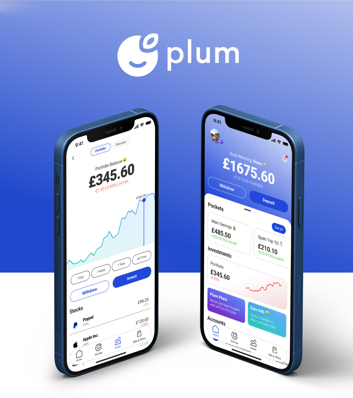
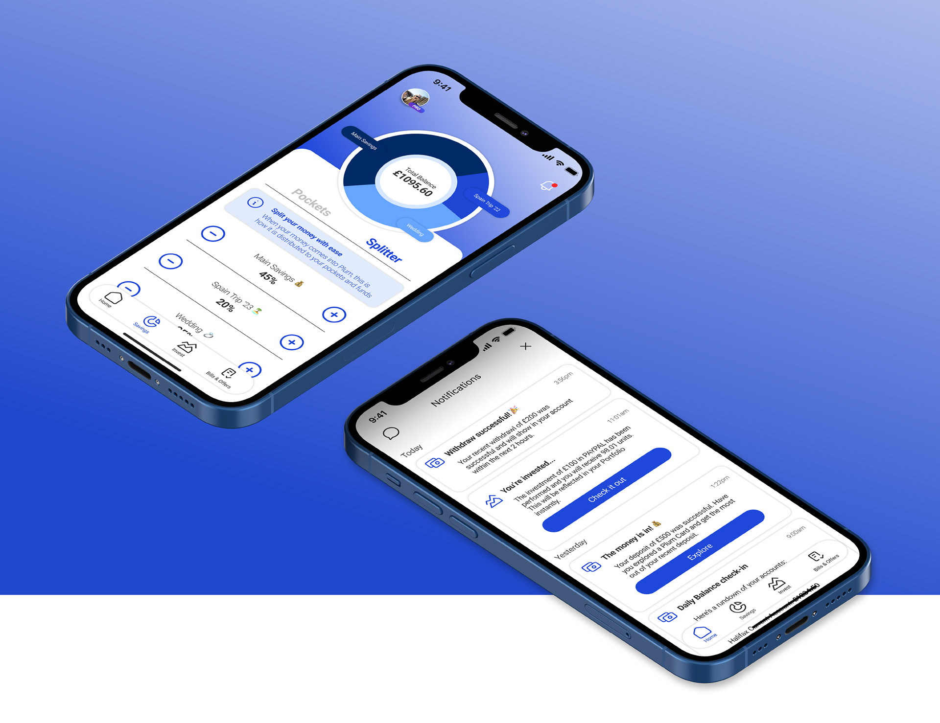
Plum is a financial savings and investments app and as a frequent daily user of the platform I started to notice that the UI was not as intuitive and clear as it could be. Especially with it being a platform aimed at making investing and saving easy and hassle-free for everyone.
This case study explore the redesign and thinking behind my own version on the Plum app.
The Problem
Saving and investing can often be seen as a daunting and intimidating experience, especially as your own money is at stake. Plum is an AI powered financial services app that helps users manage their money, setting funds aside into savings or investing into some of the biggest names on the stock market.
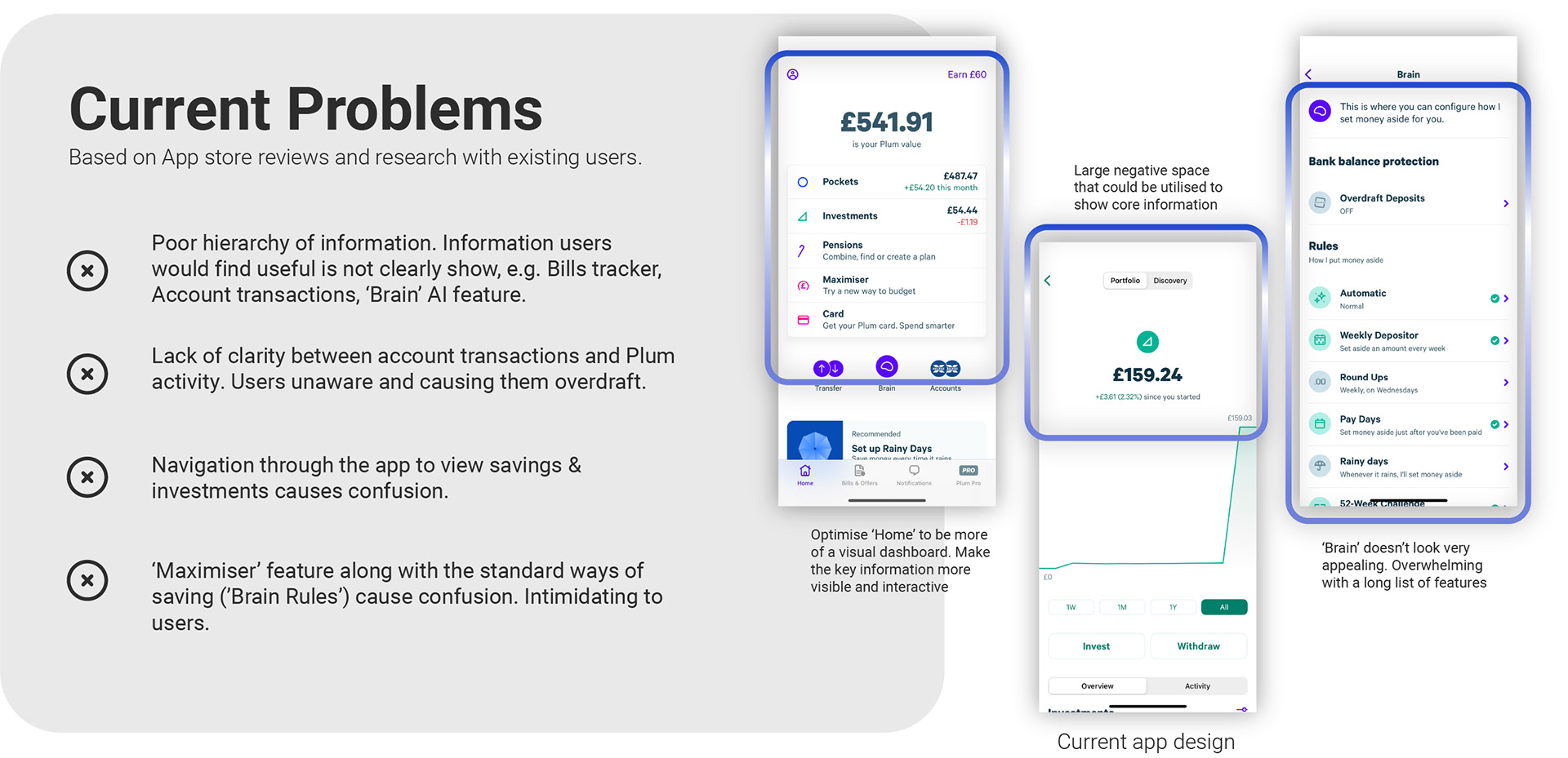
Being a Plum user I felt that there were various frustrations that prevent users from clearly understanding their financial savings and investments and also communication limitations that could be stopping new customers from joining the platform.
The Goal
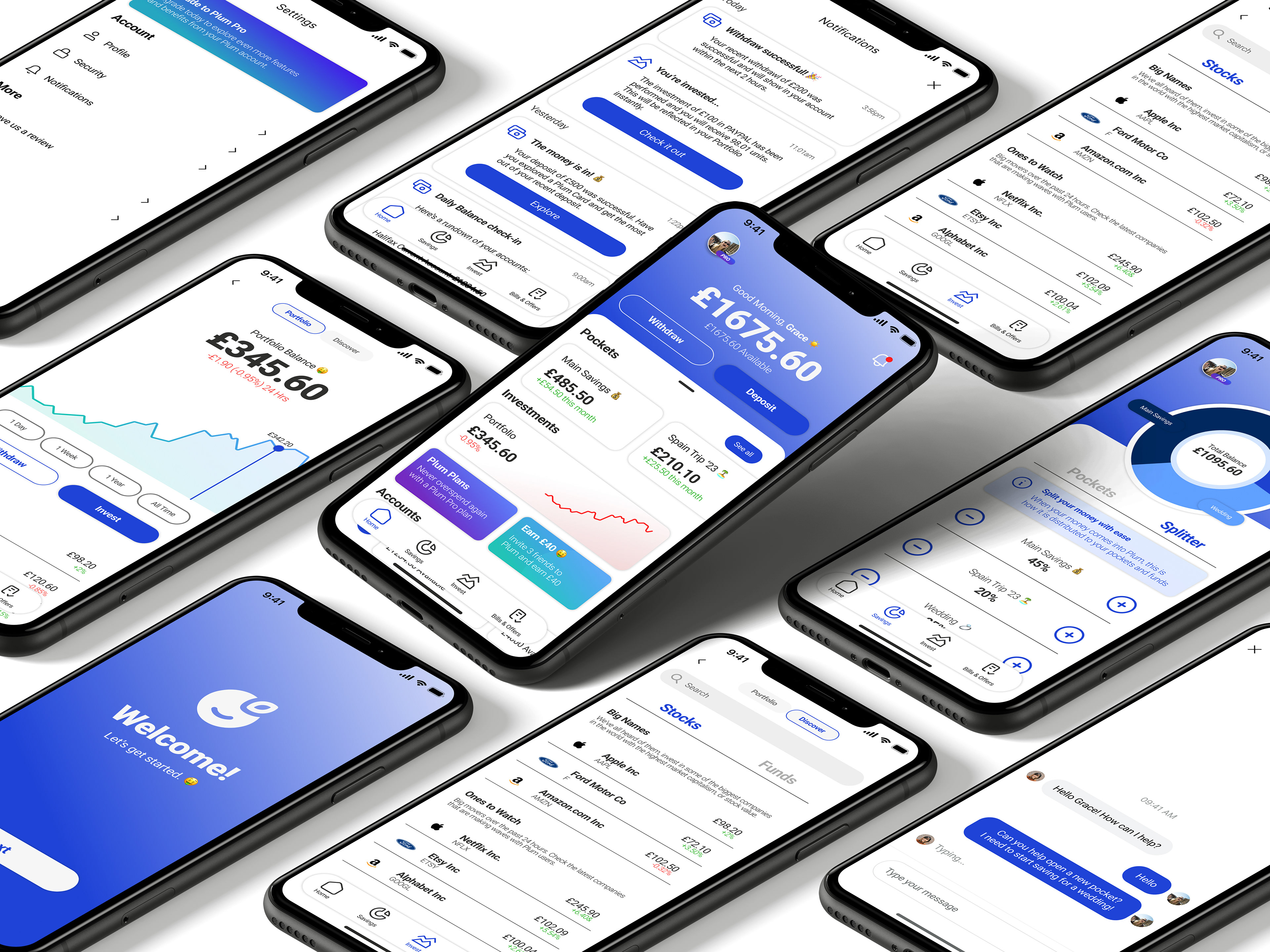
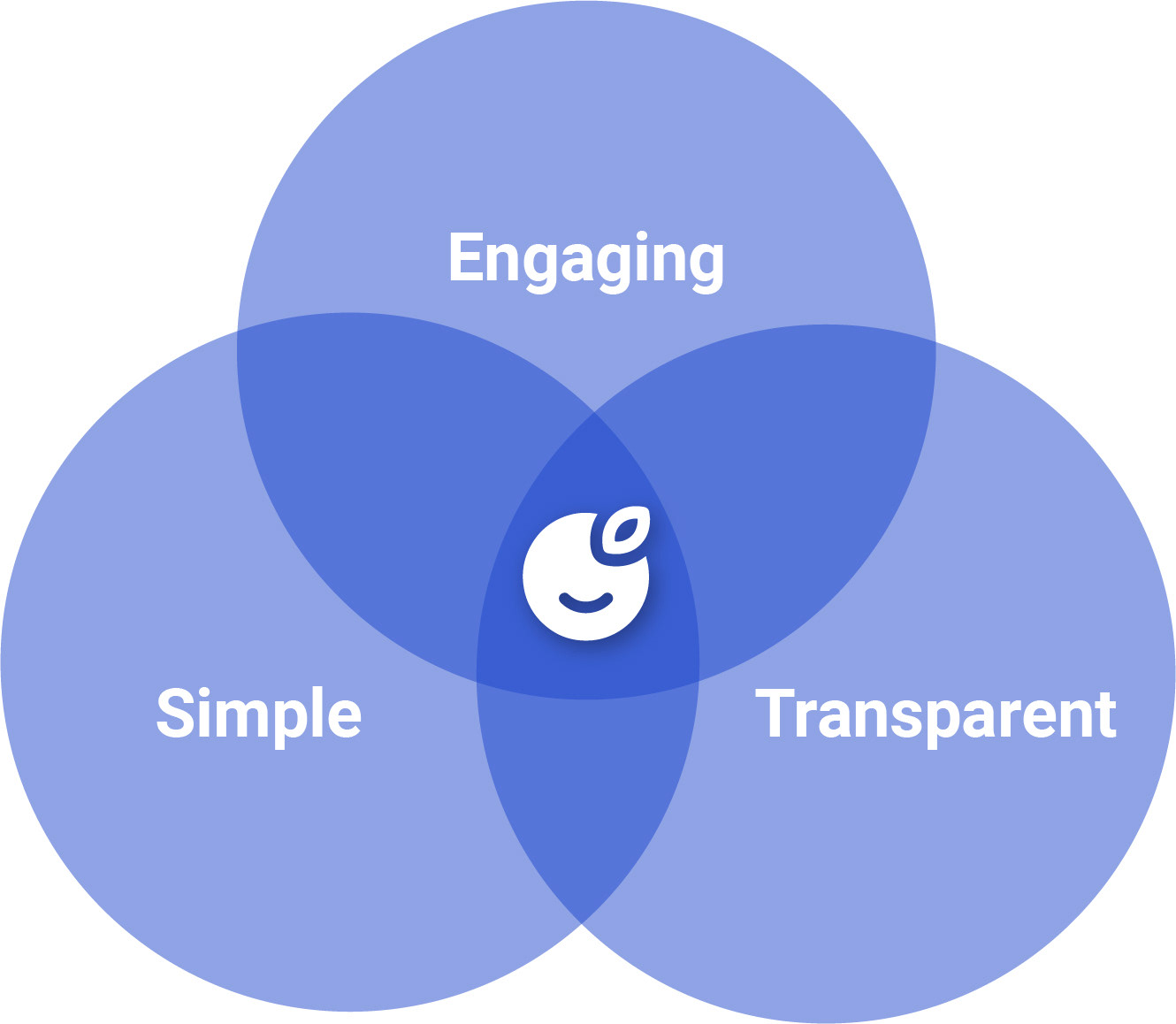
Whilst keeping to Plum’s core brand identity and image, I wanted to refresh the app by improving communication and interaction for the user. Providing an easier, more engaging and transparent experience to managing their finances.
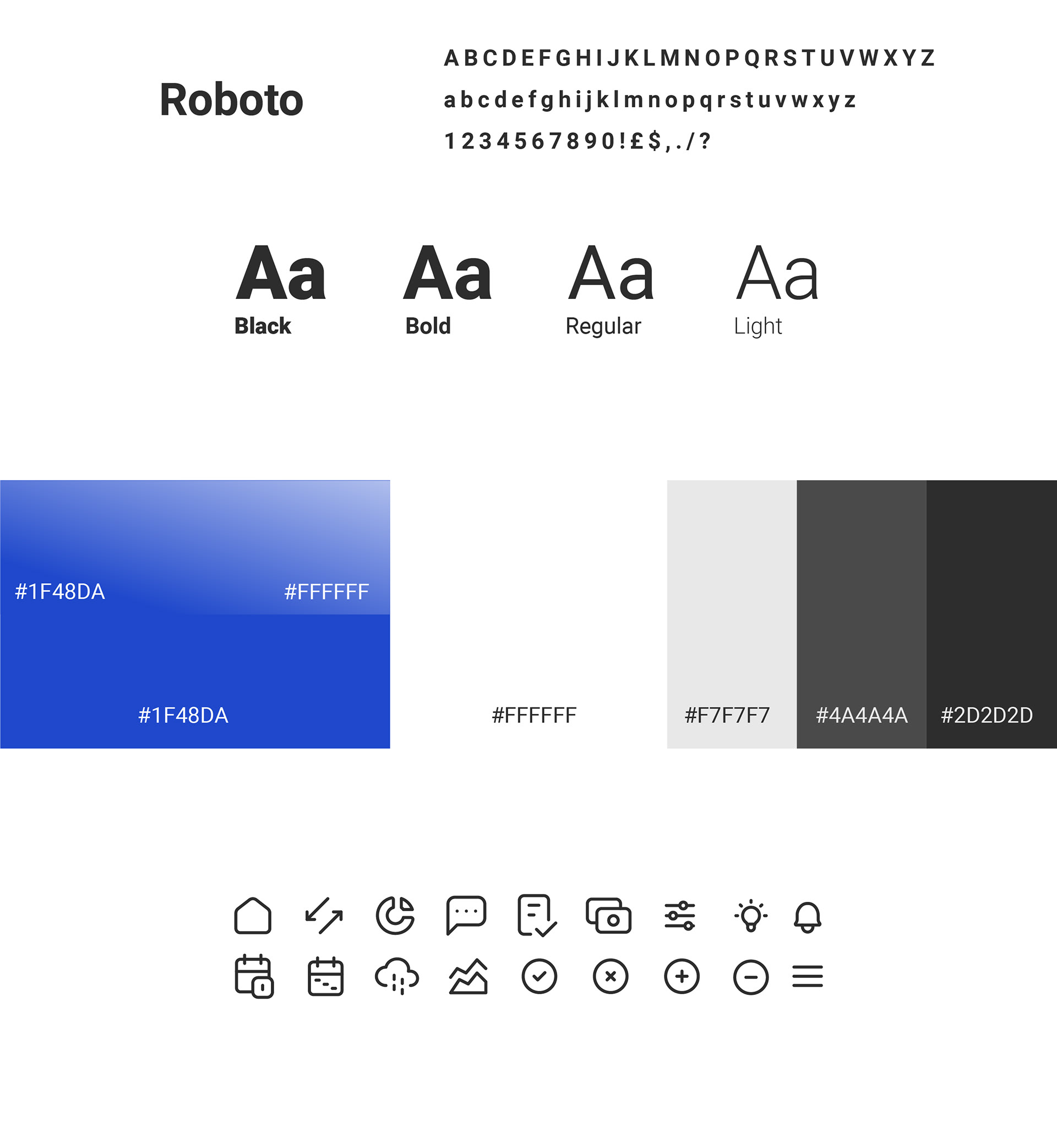
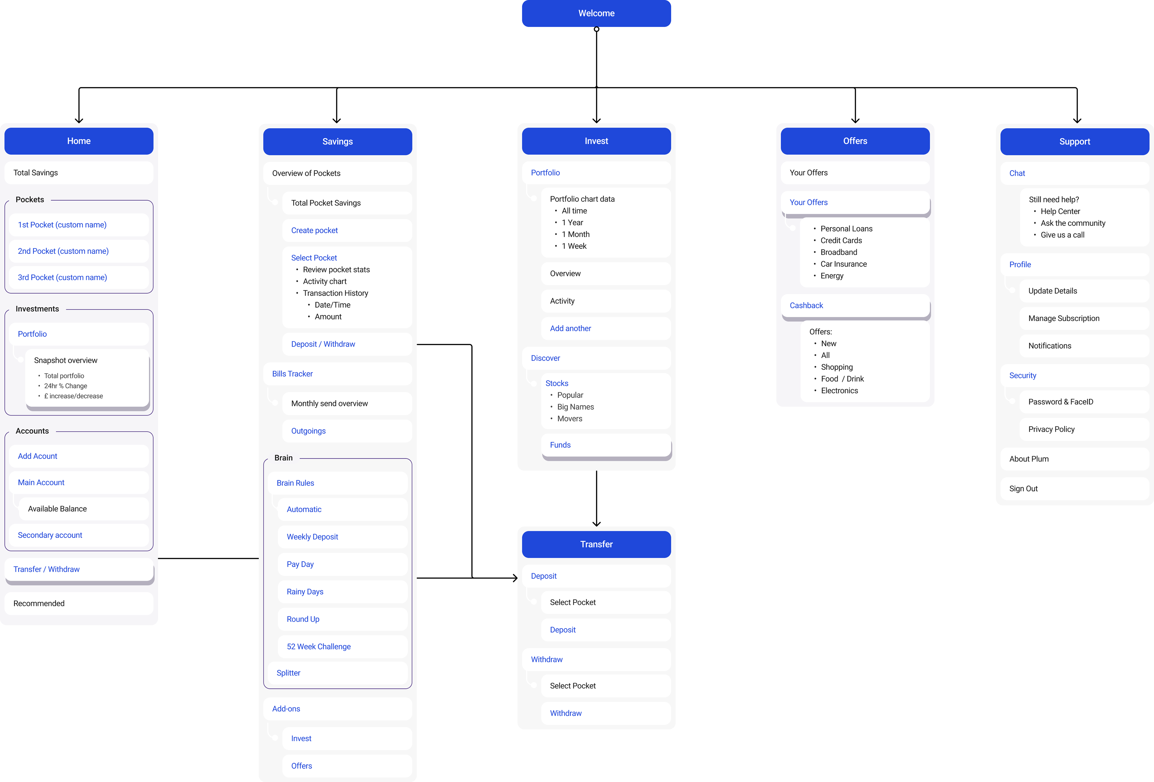
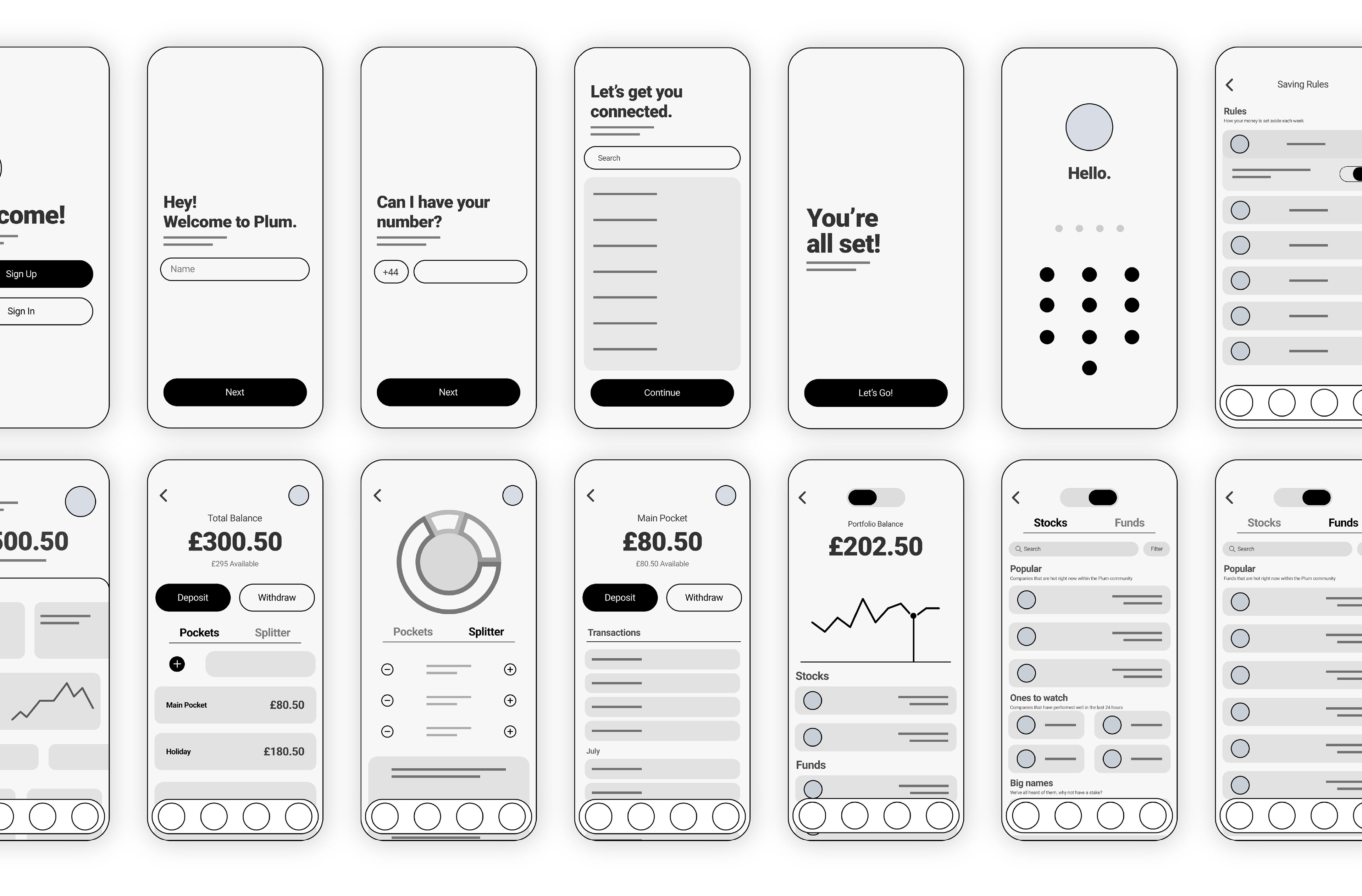
Information Architecture